

How can you design Tableau dashboards to be “Perceivable” as defined by Web Conent Accessibility Guidelines (WCAG) accessibility standards for compliance with US Section 508? This article explains how to use Tableau’s out-of-the-box features to make accessible dashboards that meet the WCAG test criteria for content that can be perceived by a wide range of users. For an overview of analytics accessibility and usability, please visit our introductory article on 508 Compliance and Tableau.

What does it mean to be Perceivable?

Information and user interface components must be presentable to users in ways they can perceive.

For the WCAG standards used by US Section 508, the Perceivable principle means making content that users can see and distinguish regardless of visual impairments. Most notably, this impacts the use of color, the presence of descriptive text, and the size & contrast ratio of that text. Users with poor color sensitivity, such as Protanopia (red-green colorblindness)or users utilizing a screen reader should be able to perceive each feature on a web page and its analytics content. 

How to design for Perceivability

Methods for improving perceivable dashboards include evaluating color, creating useful descriptive text, and  simplifying marks used in visualizations. Over the course of this article, we will improve a simple workbook from Alpine Mountaineering Agency (AMA)fictional  organization attempting to publish 508 compliant content online.

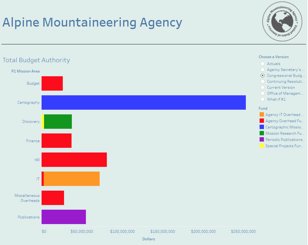
Non-Compliant Tableau Dashboard
Starting Point and Example Dashboard: Not Adhering to 508 Best Practices

To make this workbook more perceivable, we will: 

  • Simplify overly complex views with too many marks
  • Use more accessible colors
  • Supplement color-based information
  • Improve text contrast
  • Add labels
  • Add dynamic text
  • Add captions

Simplify overly complex views

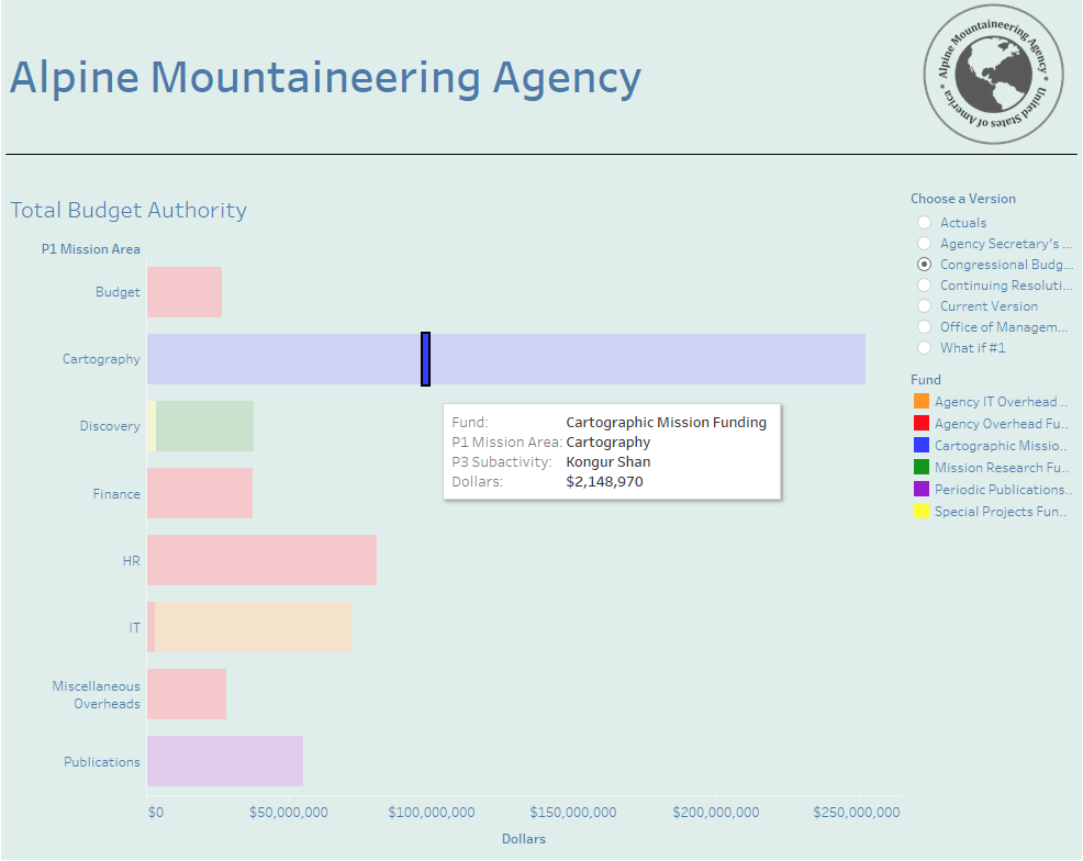
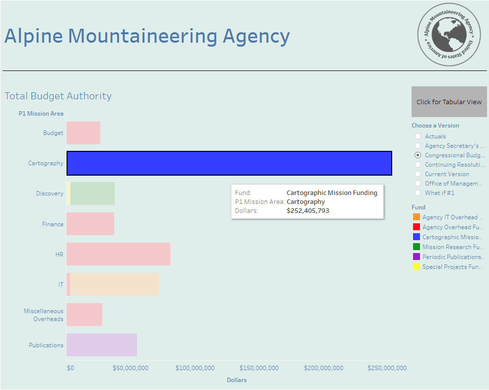
Each data element on a Tableau viz is called a mark, and there can be hundreds or thousands of marks on a single viz. This may look fine and uncluttered, but having too many marks will prevent users from stepping through the view in a meaningful way. Consider the bar chart below, which appears to have 8 bars. Each bar is actually stacked from many non-aggregated elements. The overly granular marks make labels and tooltips ineffective at communicating the primary goal of the dashboard and prevent users from taking in information.

Non-Compliant Tableau dashboard with too many marks
Dashboard with unnecessary marks

It is easier to perceive when data is summarized and aggregated, either through existing metadata or using the Group feature. If users need to see the details, there are several better ways to make that information accessible. 

  • Create separate views for analyzing details 
  • Provide filters and drill paths to enable users to narrow in on specific data 
  • Use the “View Data” feature, which shows data points and allows downloading to csv 

We will simplify the viz by removing unnecessary detail. The detailed data will be more accessible in a dedicated view on a separate tab, and we can link these two together using dashboard actions. Now each bar on the main dashboard view consists of one to two marks, and labels or tooltips will show aggregated data.

Dashboard with fewer marks

Use accessible colors

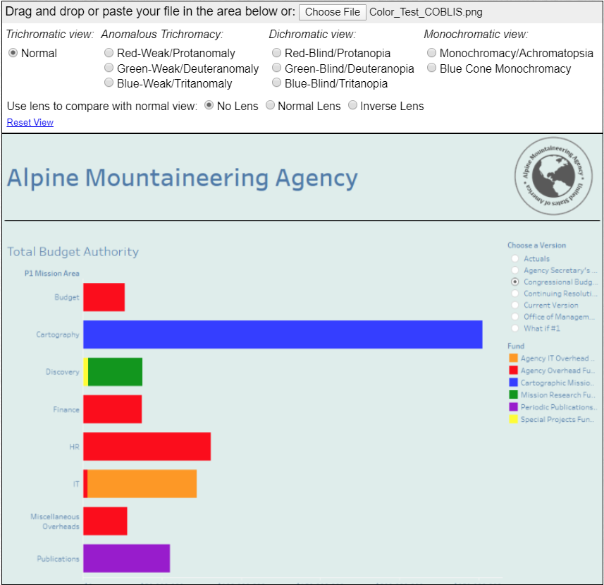
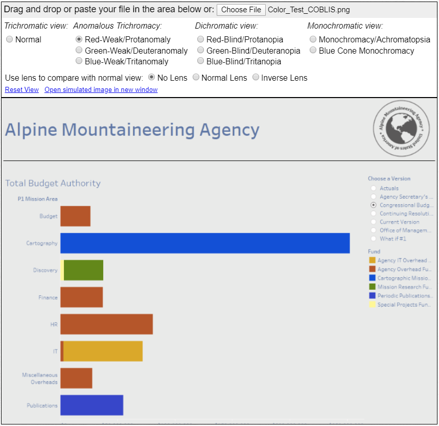
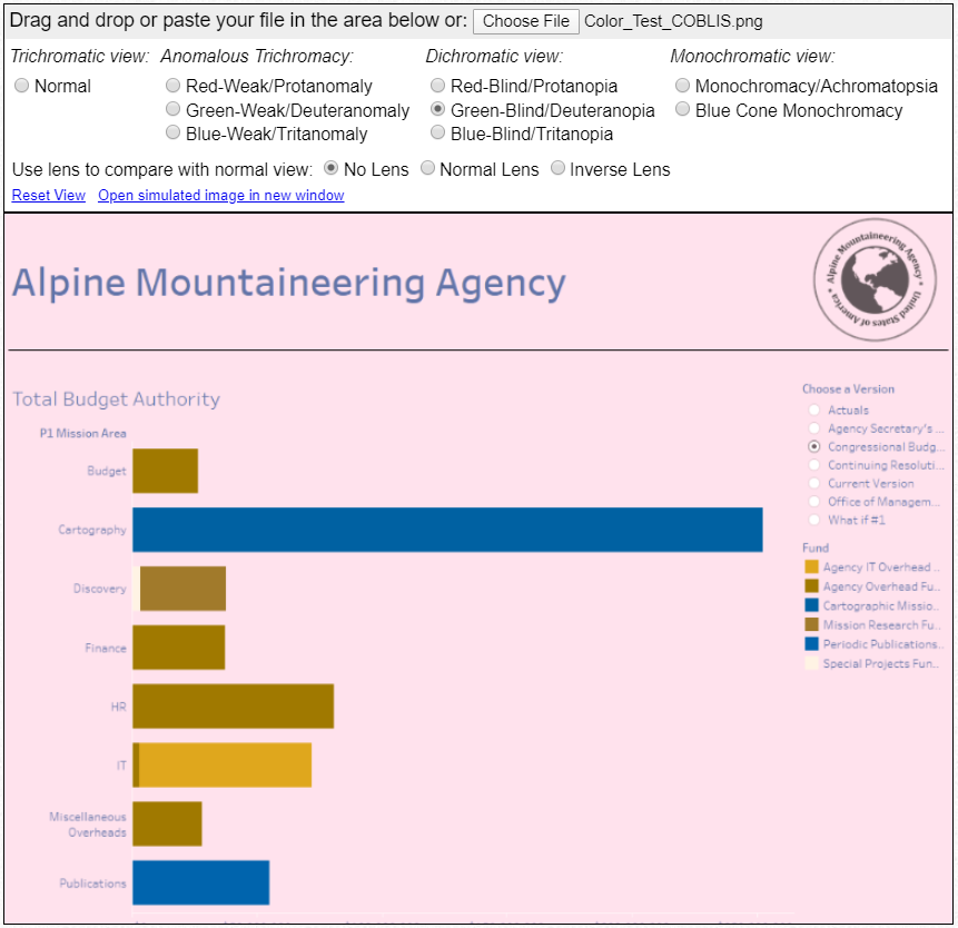
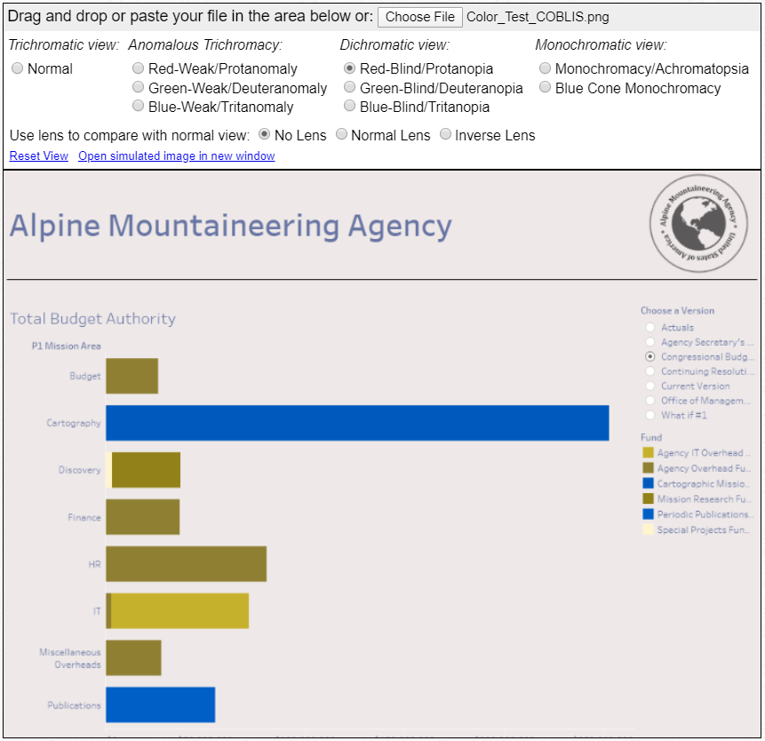
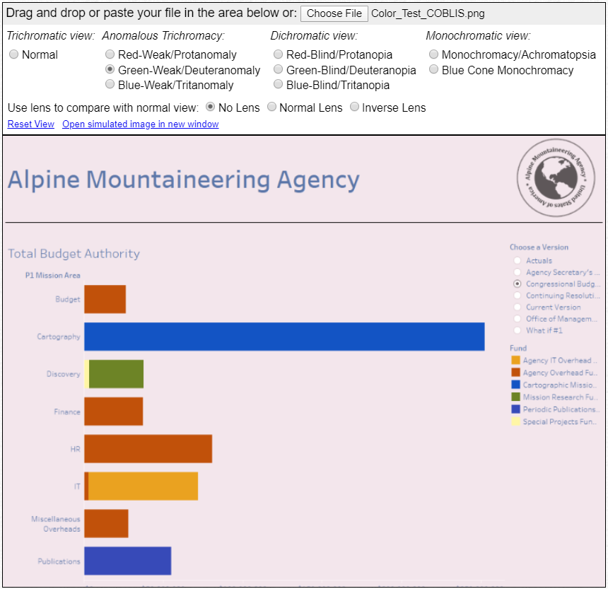
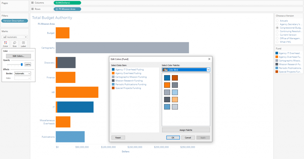
The bar chart contains marks that are only distinguishable by color, which makes it difficult or impossible for users with low color sensitivity to perceive the differences between marks. We can update the color palette to be more accessible and provide other ways to differentiate marks in the view. 

Some users may not perceive any difference between the green and red bars on the view above. See the difference below using Coblis, a free online color blindness simulator. 

By switching to the “Color Blind” color palette included in Tableau, we can default to using more accessible colors.

Dashboard using Tableau's Color Blind palette

Useful tools for testing color perception:

Color sensitivity simulators like Coblis

Contrast ratio test tools like Contrast-Ratio

Supplement color-based information

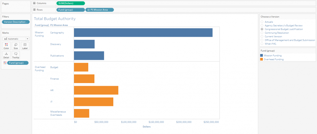
To be distinguishable, Color should not be the only visual means of conveying information. Let’s use text and position to convey information as well by adding the “Fund Type” field to the columns shelfThis allows user to distinguish the information regardless of color sensitivity. By encoding this information without using color, we can now switch to a simpler color scheme.

Dashboard using position and text labels to supplement color

Improve text contrast

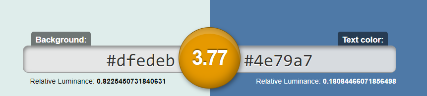
In the view above, it is difficult to read the text provided. The WCAG guidelines require text to have a contrast ratio of at least 4.5:1 between the foreground and background. In general, it is easiest to use black or dark gray text on a white backgroundIf you want to maintain a specific color scheme, use online contrast-ratio tools like contrast-ratio to check that text will be compliant. 

What is the contrast ratio for text in the AMA view? It is 3.77, which does not meet the required ratio of 4.5 or higher needed for compliance with WCAG standards. We will address this in the dashboard by switching to a white background with dark gray text.

Color contrast ratio test shows non-compliant text and background colors
Color contrast ratio test - below 4.5 is non-compliant

Note the contrast requirement is reduced for large text and does not apply to logos.

Add labels

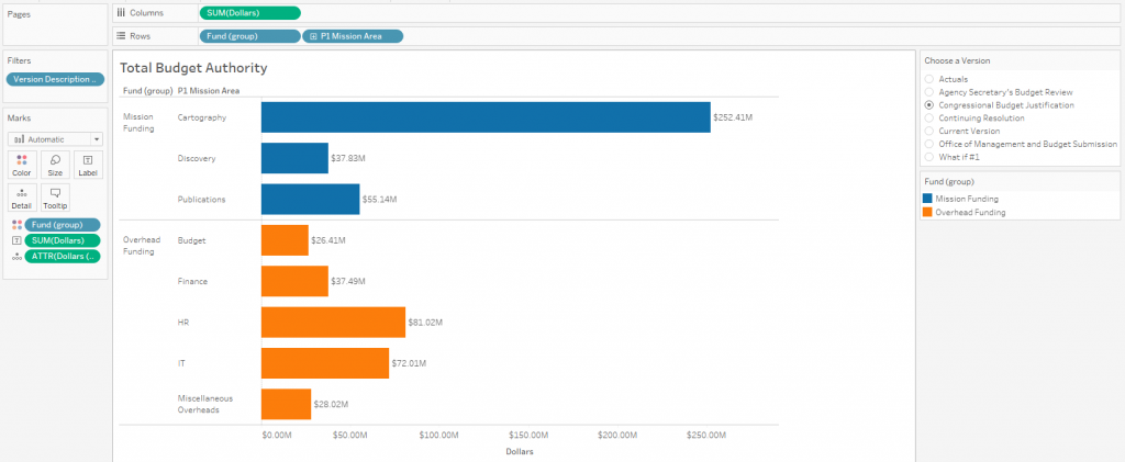
Labels in Tableau provide text-based information within a viz that can make information more accessible to users looking at the view or using a screen reader. 

With labels, it is best to keep things simple and use aggregated, rounded numbers. It can be easy to clutter a view with too much text and unnecessarily precise numbers. 

Dashboard with labels added to marks

Add dynamic text

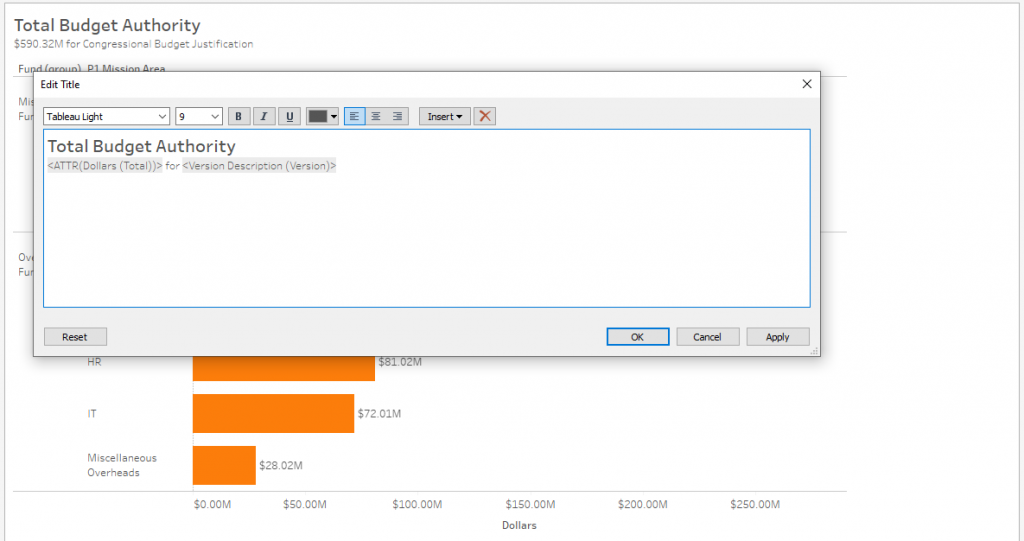
Titles, subtitles, annotations, and supporting text can all be parameterized in Tableau. This dynamic text can summarize the main point or provide additional detail. In the AMA view, we will add a subtitle which summarizes the total dollar amount in the view. 

Dashboard using a dynamic title

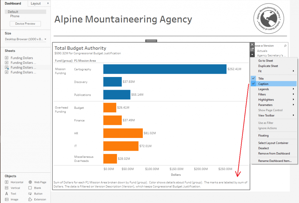
Add captions

The caption feature in Tableau automatically creates summary text explaining the viz. This timesaving feature will generate text for each viz explaining the fields and aggregations used. Captions can be manually edited, so it is easy to supplement or entirely replace the Tableau-generated text. 

For the AMA view, we will use the text Tableau creates for us. 

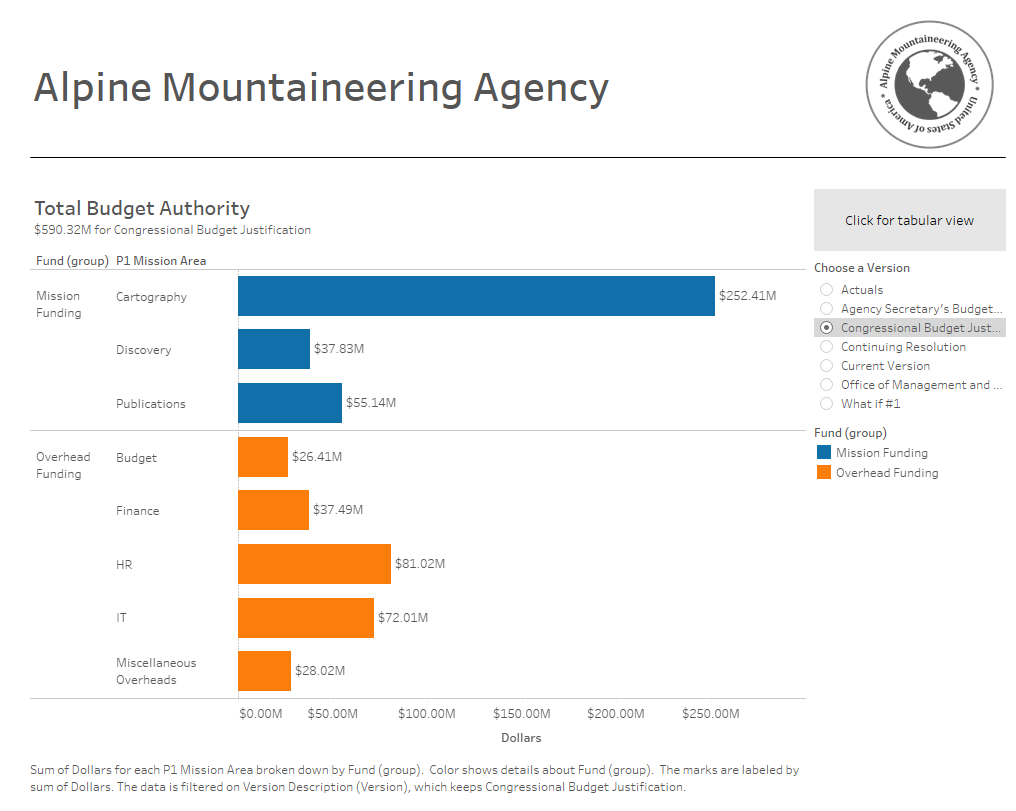
Dashboard using Tableau's auto-generated captions

A more perceivable view

Compare for yourself with the original and updated versions of this dashboard. 

Non-Compliant Tableau Dashboard
Dashboard made to be Perceivable for 508 Compliance

Coming up in this series

This was a look at designing Perceivable dashboards in Tableau for compliance with US Section 508. The next post will look at the Operable WCAG design principle. 

Want to continue the conversation?

Colored Bars
Business Intelligence & Analytics

Designing Perceivable Dashboards

How can you design Tableau dashboards to be “Perceivable” as defined by WCAG accessibility standards for compliance with US Section 508?